
📎 Company:
Claid.ai helps businesses grow by automating image preparation and improving user-generated content.
📎 Project:
AI Photoshoot can turn a single product photo into numerous unique, realistic and appealing visuals that engage customers and showcase brand style.
📎 Role:
I led all design initiatives for this project, closely worked with head of product, head of ML, developers and CEO.

01 Overview
Two months after the release of stable diffusion, we launched AI Photoshoot. The product was raw but we focused on the core functionality (transforming simple product shots into lifestyle photos using a blend of AI technologies.)
Despite its imperfections, it was a starting point for acquiring users and improving our product based on real-world data.
Challenge:
The big challenge was to create an interface for a product in a completely new category.
02 Discovery
To identify user interface issues, I needed to collect quality data from various sources. In this step I analyzed:
👉 HotJar recordings — A large portion of users struggled with how we named features, dropping off before they could find the right one and experience the value of the product.
👉 Amplitude metrics — I noticed a consistent trend among users: they would only try one or two images before drop-off, despite the fact that our Free Trial had a high image limit.
👉 User interviews — Based on the analysis of main user flow, I concluded that design followed an imperative approach, which added unnecessary complexity to the already challenging task of working with AI.
👉 Typeform surveys — At the beginning, we created a landing page with simple forms and diverted traffic to it to gauge interest in our product. Later, we used surveys to collect user feedback.
Understanding the problem
For the first release, we took an imperative approach to our UX, driven by how things worked under the hood. It created friction:
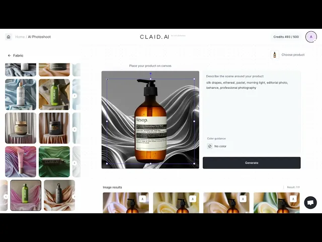
We provide a library of templates for generating product images. Templates set the scene and guide the network, but allow some degree of freedom to achieve a higher variety of output images. To highlight that each generation can produce a new, different image, we initially made our templates black-and-white.
Problem:
Some users expected to receive black-and-white output images, while others users couldn’t achieve attractive results by picking up the colors and placing the products themselves.

The biggest problem was:
Some users expected to receive black-and-white output, another users couldn’t achieve attractive results by setting colors and establishing product placement themselves.
Talking to users helped me verbalize ‘why’: people do not think in steps; ‘why’ users didn’t want to put in the effort to get the picture they wanted.
I decided that we need transition to a declarative approach in design. Because users couldn’t even imagine the result that they want so they had problems achieving it.

03 Definition stage
Hypothesis
Users can’t always visualize what they want to achieve. Moreover, few were ready to spend time experimenting before they got a satisfying outcome.
🖍 Black-and-white templates confused users. My hypothesis for a solution: “We can help users choose the correct template by showing them in-colour reference images.” For many, making a choice is easier when they have a visual representation of what they can expect (even if it’s not final).
🖍 Template categories based on market segments. My hypothesis for a solution: “Since templates can be used across different categories, grouping them by market segments is counter-productive.

04 Define metrics
To align my work with wider business goals and user satisfaction, I picked the following metrics to track:
Business — MAU
User — Satisfaction with results
Design — User engagement
05 Design
Design challenge
How can I design a solution which would work well for a variety of different contexts (type of product photos, businesses, skills, and time) and allow users to achieve good image results quickly?
Design strategy
I started filtering through all the information I’d gotten and elaborating on it to define the main problems and the design challenge.

👉 Build functional, reliable, usable.
Functional: Claid’s function is to help people create product images.
Reliable: Fast and consistent response.
Usable: Claid give user different ways to start generation.
👉 Focus on the usable.
Our primary goal to help users achieve better outcomes, faster.
👉 Delight and make it pleasurable.
This step wold be about making the generation experience delightful.
What I proposed
The main idea is to show users what they can expect. I decided to create more templates, divide them by categories, and show them in color.
Inside each category, I added real examples with the product. The previous version didn’t include the preview of the possible result.

Interesting observation: this behavior is similar to when designers choose a mockup for their product.
Prompt Box Improvement: Users often confused our prompt box with those from ChatGPT. For instance, they would type commands like “place product on a table” instead of describing the scene. For clarity, we improved the message and provided an example. I made color guidance a separate control, with a predefined color that suits the chosen template.

Changed Sidebar: Initially, the sidebar with templates had a black background. During user testing we understood that users ignored the sidebar due to the choice of color, as it created an impression that the sidebar was completely unrelated to the working area.

06 Delivery stage
Since we didn’t have much time we had to move fast, we skipped ow-fidelity prototyping and went straight into delivery and conducting UX studies in production.
Making my case:
All together, these changes made for a significant shift in approach. Not everyone was on board right away. We had a healthy internal debate about the potential upsides and risks. In the end, we opted to ‘disagree but commit’. The team started to prepare for a release…

07 Outcomes
Positive impact and good engagement

Key takeaway
I came to the realisation that UX design in AI tools should not be copied from the backend logic. It became apparent that such an approach proved to be overly complicated for users who were not directly involved in the development process
My responsibilities
Conduct stakeholder interviews
Present key findings and explain them to the team
Allocated resource
Curated templates
Conduct user interviews and surveys
Analyzed user behaviour data
Do market research
Created design system
I hope this information was useful! :)
If you liked this article sharing it with friends is greatly appreciated!